

What to change
Ask your supplier to provide an obvious, clearly named dismissal control that remains usable on phones, with larger text and through keyboard navigation.
A worked example
Illustrative example
A visitor can reach a labelled Close action at the start of a help popup, dismiss it and return to the original page.
Why this matters to your practice
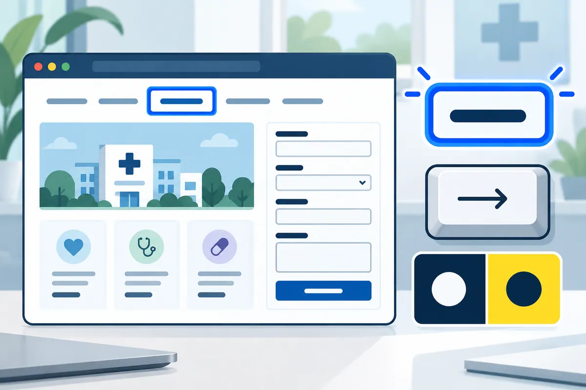
A visitor should never have to hunt for the way out of a popup. A small cross may look familiar, but its size, position and spoken name still need attention. Ask the supplier to show it on a phone and with larger text, then demonstrate it using a keyboard. A clear Close label can help where an icon alone is ambiguous. Making the clickable area larger is useful only if it does not cover another control or part of the heading.
A practical review example
A tiny cross squeezed beside a long panel title may be easy to miss or tap inaccurately. Ask your supplier to open the panel on a real phone and dismiss it with an ordinary movement. Then enlarge the text and repeat with a keyboard and reading software. The control needs a useful name and visible current position. Enlarging its invisible click area helps only if that area does not cover the heading, another link or the first question inside the popup.
How to check the result
Accept when dismissal is readily discoverable and operable across the supported screen sizes and input methods.
A mistake to avoid
A large invisible click area around the cross can accidentally cover nearby heading links or the popup's first interactive control.
Turn reading into a next step
Your action checklist
Work through these checks with your team or supplier. Tick the ones you have resolved and leave unknowns open.
Record what you know, what is still missing and the answer you need from your team or supplier.
Use project decisions only, without personal, patient or confidential details. Entries stay in this page and are not submitted to Kay & Co. Copy or download before leaving; this page does not save your notes.
Further reading
These sources provide background for the topic. The practice examples and checklist are illustrative planning suggestions from Kay & Co.
Related guides
Need help with this?
Tell us what is getting in the way. Kay & Co. can help you understand the options and turn the next step into something that works for your practice.
Explore websites & patient experience services or discuss your project.
Try the free Healthcare Digital Planner to find your starting priority.